
№00
At a Glance
30+
Controls
Built from scratch, not a plugin
6
Profiles
One click each, argued for
1 month
Design time
Research to dev handoff, early 2024
95
Tab stops
The launcher is not one of them
№01
Long story short
The founder wanted something like UserWay on our site. Two reasons, legal worry and a product we could sell later.
I designed it end to end in about a month. The research, 30 plus controls, 6 profiles, both themes, mobile, and a spec sheet describing every single control. Built from scratch, not a plugin.
The developer built almost all of it correctly straight off my documentation. The 2 things that came back wrong I caught in staging before launch.
It went live in 2024. Its still live today, unchanged.
I lost the argument for screen reader support, keyboard navigation, and voice navigation.
Those are the 3 things that matter most to the people the panel names on its own buttons.
Nobody ever ran an accessibility audit on the site. Not while we built it, not in the two years since. I ran the first one in August 2026, because I was writing this up and did not want to publish something I half remembered.
Tab through the page and you never reach the button that opens the panel. 95 stops from the header to the footer, and the launcher is not one of them.
№02
Role, team, timeline
UI UX Designer. Around a month, early 2024.
WHAT I OWNED
Research
Full control set
The Profiles
Mobile layout
Documentation
Dev handoff
QA in staging
TEAM
The founder, my design lead, one fullstack developer, me.
NOT MINE
The build, and the decision to make it in the first place.
THE CONSTRAINTS
One month.
One designer, one developer
No researcher, no accessibility expert, no budget for either
Brand colour was fixed.
Yellow, and not negotiable
Whole site.
WordPress, every page.
№03
What I actually knew going in
A LinkedIn course on accessibility foundations. A day on YouTube learning what ADHD and dyslexia actually are. Then I pulled apart UserWay and accessiBe and copied most of the feature list off them.
Thats the honest version.
I designed for 6 disabilities in a month without ever speaking to one person who had any of them.
What I did not know is that there is a well documented position in the accessibility community against tools like this. It was not in my head in early 2024. It would have changed what I built.
№04
The decisions I made
DECISION 01
The profiles, which I had to argue for.
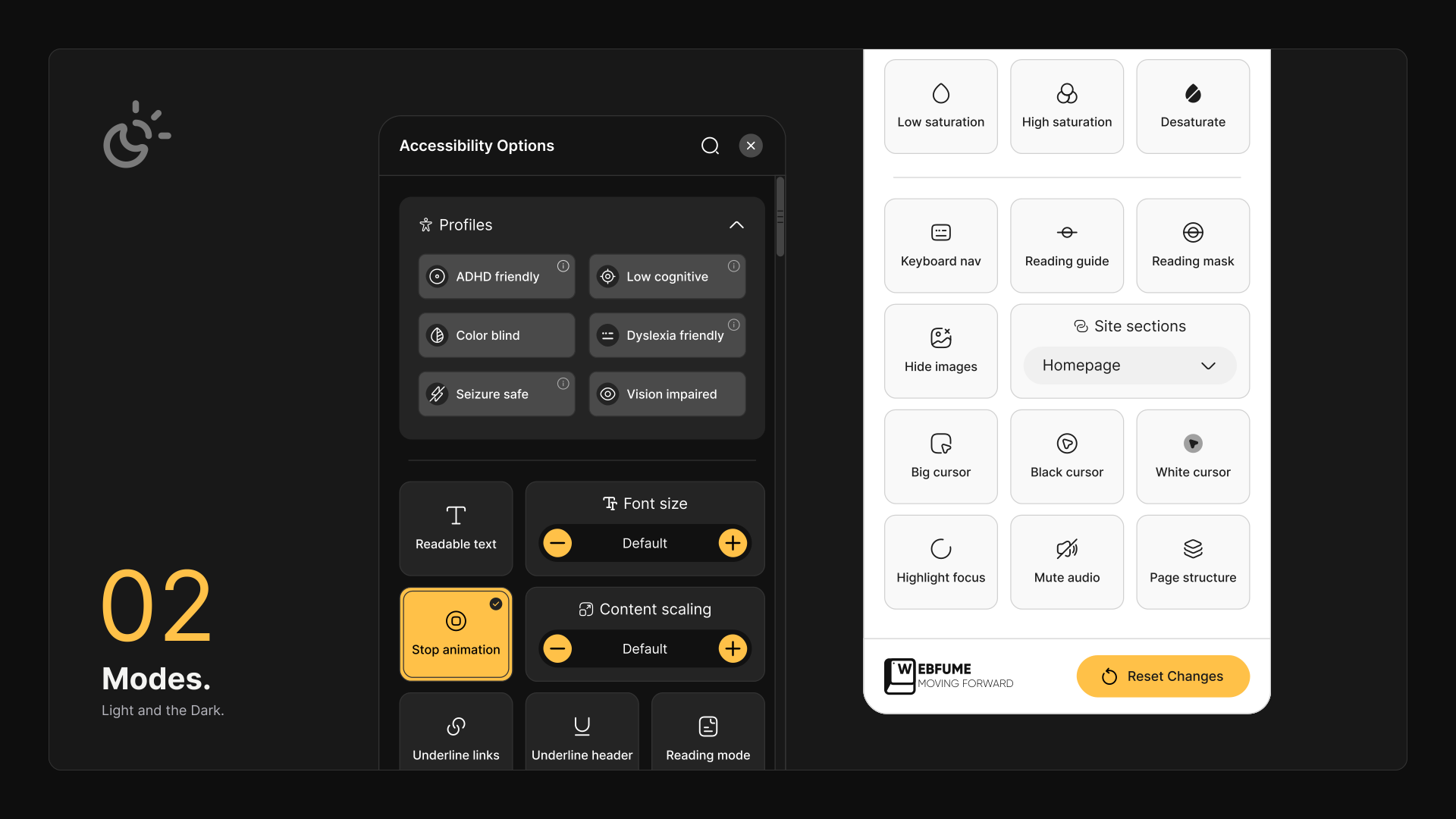
I pushed back. 30 plus controls is a lot to read and scroll through for someone who is already having a hard time reading and scrolling. 6 presets, one click, done. I won that one and I still think the reasoning was right.
DECISION 02
I made every profile say exactly what it would change.
An info icon on each, listing the toggles. ADHD friendly turns on stop animation, reading mask and low saturation. Nothing hidden.
DECISION 03
I put the launcher on the left.
The right side already had chat, the meeting scheduler and back to top stacked up.
DECISION 04
I wrote a spec sheet for every control.
What it does, what it changes, in plain sentences, for the devs. Example, Readable text says to replace all the website fonts with a more legible option such as Roboto. That level is why the build came back as close as it did.


№05
What broke
Two things, both caught in staging.
I had put the launcher on the right.
Easier thumb reach for most people on mobile, which is why I chose it. It covered the menu completely. I took it back to the team, they tried to fix the overlap, it still collided at smaller widths, so I moved it to the left.
The reading mask came back inverted.
The middle of the screen dimmed and the top and bottom clear, which is the opposite of the point. I had given examples upfront. I flagged it and sat with the dev until it was right.
Neither of these came from QA. They came from me opening staging and using the thing.
№06
What never got built
Keyboard navigation, screen reader support and voice navigation. I asked for all 3 and lost all 3.
Keyboard navigation
No excuse
Screen reader support
Dropped
Voice navigation
Dropped
For voice navigation and the screen reader, the reason was real. There was nothing reliable we could pull in at the time and not enough developer hours to write it. Still the wrong outcome, but I understand it.
Keyboard navigation is the one I have no excuse for.
It never needed a library. It needs correct markup and somewhere for focus to go, and it should have been the cheapest thing in the whole build. I did not know enough then to say that in the room, so it went in the same pile as the other two and got cut with them.
I ran Windows Narrator over it myself near the end. Nobody asked me to. The info button, the one that explains what each profile does, reads out as “graphic”. So the explanation is unreadable to anyone actually using a screen reader.
Every one of those cuts had a sensible business reason. Dev capacity, brand, timeline. With that budget I would probably make one or two of the same calls myself.
THE COST
And every one of them removed the thing that would have made this useful to the people whose names were printed on the buttons.
№07
What the audit says, two years on
I opened devtools on it in August 2026, ran Lighthouse, axe and WAVE, and tabbed the page by hand. First accessibility audit this site has ever had.
The keyboard result is the one that matters.
95
TAB STOPS
from the header down to the footer, and the launcher is not among them. Keep going and focus wraps back round to the logo. A keyboard only user cannot open the panel at all.
Open it with a mouse and it gets worse. Nothing inside takes focus. Not the toggles, not the profile buttons, not the close. Escape button does nothing.
SCREEN READER
The launcher has no accessible name either.
No label, no title, no text inside it. So a screen reader announces it as “button” and nothing else. Two independent failures on the same element, and either one on its own would be enough.
UNCHANGED SINCE 2024
The info icon still reads as “graphic”.
Same as when I ran Narrator over it in 2024. Two years, unchanged.
The site scores:

AXE DEVTOOLS
axe DevTools, panel open, WCAG 2.1 AA ruleset, 26 issues. 5 critical, 21 serious

LIGHTHOUSE
Lighthouse accessibility 80 on mobile, 78 on desktop
WAVE / WEBAIM
WAVE, 63 errors, 3 contrast errors, 182 alerts. WebAIM scores it 4.6 out of 10

And WAVE returns exactly the same result with the panel open as with it closed.
Switching the accessibility widget on changes nothing an accessibility tool can detect.
A few other things I found.
I remembered the settings expiring after about a week. They do not. localStorage has no expiry, so the panel never forgets. What I had been remembering was a browser clearing its own storage, not anything we built.
And the naming was never necessary.
The info tooltip already said stop animation, reading mask, low saturation. Those words could have been the label. I put the diagnosis on the button and the useful description one click behind it.
The only usage data I ever saw was one Hotjar screenshot from my lead. Stop animation had the most heat by a distance.
№08
The one thing I would do the same way
The documentation.
One developer built 30 plus controls, 6 profiles, both themes and a mobile layout off my spec sheet, and almost all of it came back correct first pass. The 2 things that were wrong, I caught myself.
That was not luck. Every control was written as behaviour, not as intent. What changes, in what order, at what point. “Improves readability” is an instruction to go and interpret something, and interpretation is where rework comes from. A line describing exactly what moves and when leaves nothing to decide.
INTENT
“Improves readability”
An instruction to go and interpret something.
BEHAVIOUR
What changes, in what order, at what point.
A line that leaves nothing to decide.
I write specs for much bigger systems now and the level has not changed, only the volume. It is still the cheapest thing a designer can do to protect their own work.
№09
What I would do differently
01
Audit first.
One afternoon with Lighthouse, axe and a keyboard would have told the room what the actual problems were, before anyone decided what to build. I finally did it two years too late.
02
Fix the source, then get out of the way.
Screen readers, OS contrast, OS text size, reduce motion. People already have these, already know them, and they are better than anything I was going to ship in a month.
03
Name the setting, not the person.
“Reduce motion and distraction” does the same job as “ADHD friendly” and does not ask a stranger’s website to be told about your brain. The right words were already sitting in my own tooltip.
04
Test the tool with the tool, on day one.
I ran a screen reader over it once, near the end, and immediately found problems. Doing that in week one would have changed what I asked for and how hard I pushed for it.
05
Put a date on a temporary fix.
There was a plan to go and fix the source code properly and the widget was meant to hold the gap until then. I never asked for a date on that plan. A temporary fix with no deadline is a permanent one nobody has admitted to yet. Its been 2 years.
I thought I was making the site more accessible. I was making it easier for us not to.