LPL Investor Experience
Building an investor experience for a firm that only ever talked to advisors

Long Story Short
LPL Financial is a Fortune 500 wealth management firm. 8 million Americans, $2.3 trillion in client assets, 32,000 plus financial professionals. And for years their website only really spoke to the advisors.
Before 2025 there were exactly 2 pages on the whole site aimed at investors. Everything else, you had to ask your advisor. Every time.
We rebuilt those 2 pages and added 20 more. I designed half of the new ones.
Traffic to the original 2 roughly tripled. Advisors reported converting more investors into clients.
Then, with everything already live, I got lost on a page I had designed myself. That led to the change I am proudest of here, but it cost us an extra month.
———
The Challenge
Put everything LPL offers investors on the site, without burying anyone.
Investors are not one group. Someone with $50,000 saved and someone with $20 million planning a wealth transfer land in the same place and want completely different things.
The constraints:
AEM components only. LPL's site is assembled from prebuilt blocks, so every solution had to fit inside what engineering had already built
A 500 plus component design system. Everything came from it
Compliance. Every word went through review, so copy always landed late
Advisors were the existing channel. Whatever we shipped had to help them, not compete with them
———
Role, team and timeline
Product Designer. 7 months. I designed 10 of the 20 new pages, at least 2 directions or versions each, and ran the stakeholder review for every one of mine, presenting straight to LPL's VP of Design and the business stakeholders.
July onboarded
Early August first batch live, 4 to 5 pages including the 2 rebuilds
Mid September the rest live, 22 in total
Late September got lost looking for my own page
October renaming and rebuilding the navigation
November to December measuring
Team: Lead Product Designer, VP of Design at LPL, Content Writer, AEM specialist, me.
Not mine: the VP set the information architecture. My lead designed the other half. Every word of copy was written by the content team.

What we found
A report kicked the whole thing off. Visitor data, advisor surveys, advisor interviews.
Advisors had become a human search engine. Every basic question routed through a person. Fine for a first meeting, expensive across millions of clients.
Mobile was the surprise. Most of the traffic came from phones. I had assumed desktop, because the old site was built for advisors at their desks and I carried that straight over to a completely different audience without checking it.
We never spoke to an investor. Not once. In regulated wealth management the relationship belongs to the advisor and you do not get to go around them. Advisors were the closest proxy we had, at every stage, including how we measured the result at the end.
———
The decisions I made
The way we worked came out of a mistake I made in my first weeks.
I wanted motion on a few pages. The design system said the components supported it, so I had the creative team build GIF options and put them in the designs. In review the VP asked if this was actually buildable. I said yes. The AEM team came back two days later and said no.
Back to the creative team for static images. Days of their work gone, deadline pushed.
So I proposed we flip the order. Build it in AEM first, confirm it works, then take it to review. That killed most of the back and forth for the rest of the project.
The lesson is narrower than "check your assumptions." A design system tells you what was designed, not what was built. I had been treating those as one question.
2 directions for every page. Different components, different hierarchy, different links at the bottom. When the kit is fixed, design becomes a hierarchy decision, and 2 options force the room to argue about hierarchy instead of taste.
Then I sat with the AEM team to try and break them. Text that fits beautifully in Figma reflows into something else when the column narrows. Plenty of finished-looking work fell apart in those sessions, which is exactly what they were for.
To be clear, this was not a split test. No live variants, no metric picking a winner. Just options hardened against reality, then a real choice for stakeholders.
———
What broke
Late September. Everything was live. I went to check a page I had designed and I could not find it.
I knew what it was about. I could not remember what it was called.
Two problems stacked. The navigation was crowded and hard to scan. And we had named pages using our internal terms, which meant nothing to an investor. We had been living in this content for months, so every name felt obvious to us. We were the ones who made them up.
I took it to my lead, then we went to the VP together. Rename the pages that needed it. Add a short description under every nav link so you know what is behind it before clicking.
The descriptions were not free. They add height to a menu that was already crowded. A taller menu you can read beats a compact one you cannot.
Less renaming than you would expect. Both original pages, and 5 or 6 of the 20 new ones.
October still went entirely into it. Every description written, cleared by compliance, held to one line, checked against the page titles. Then every renamed page traced so no existing link broke.
You can check the result. As of mid 2026, Individual Investors is the only section on LPL.com where every nav link carries a description underneath it. Advisors and Institutions are still bare link lists.
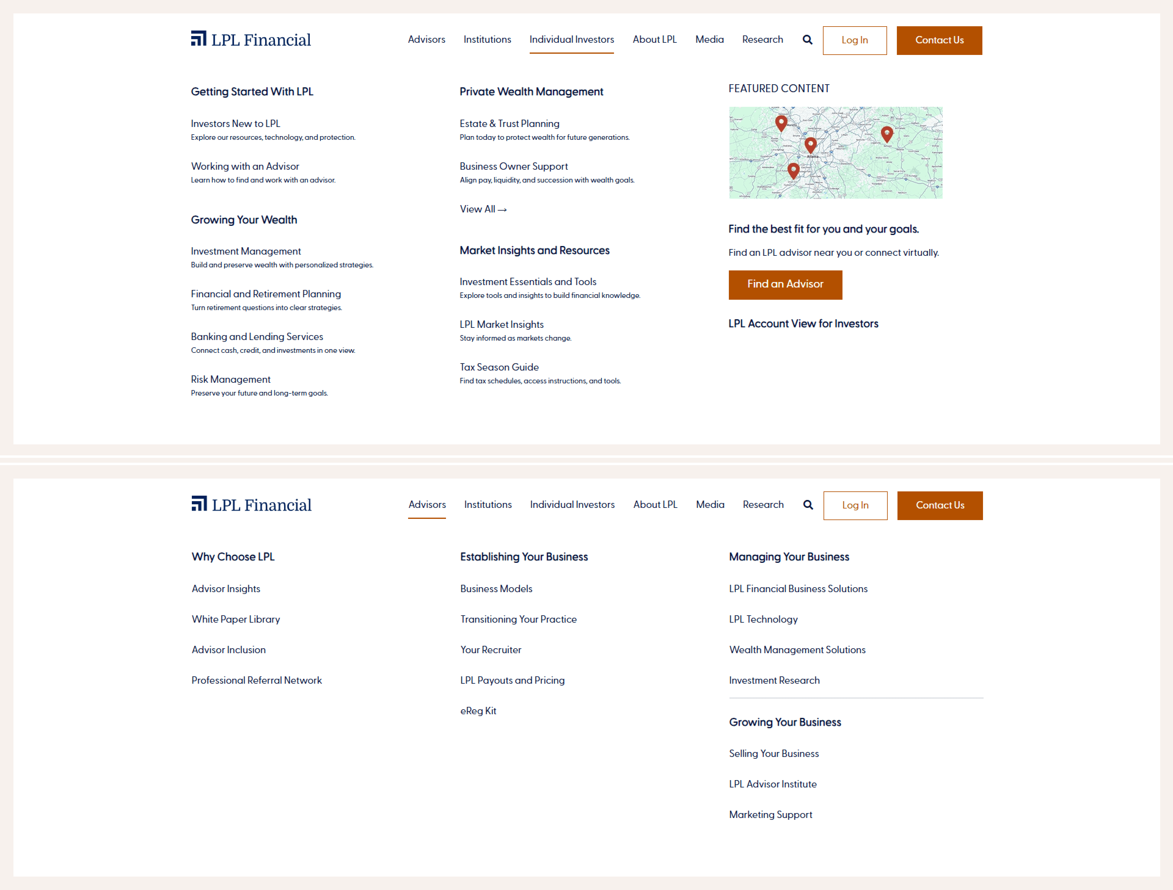
Top: Individual Investors megamenu, Bottom: Advisors megamenu. As of August 2026.
———
Where it landed
4 groups, plainly named, each with a line explaining what is inside.
Getting Started With LPL new to the firm, or your advisor recently moved over
Growing Your Wealth investing, retirement, banking and lending, risk
Private Wealth Management estate and trust, business owners
Market Insights and Resources tools, calculators, commentary, tax
22 pages, zero custom components. All of it assembled from blocks that already existed. That was deliberate, not a compromise, and it means nothing in here needs a designer or a developer around to maintain it.


Details I sweated
I designed the mobile version so that it could not break.
Two rules. Every section got a hard text ceiling, which went to the content team as part of the brief. Every image slot got a fixed aspect ratio.
Nothing overflows when the column narrows, and no image crops into nonsense, so a photo of two people talking never becomes a photo of a shoulder. What gets approved on desktop is what shows up on the phone.
Best part is that it holds without me. A writer working to a word count and an AEM author dropping an image into a fixed slot cannot accidentally break the layout.
I taught myself AEM to fix things nobody had flagged.
Once pages went live I kept spotting small things off. Padding that did not match. Spacing going irregular at certain widths. Images cropping wrong. Nobody had raised any of it, but it is the difference between a page that looks considered and one that looks assembled.
So I learned enough AEM to open a test page and change things myself. I rebuilt the problem sections there, checked them on desktop, tablet and mobile, and sent the team exact fixes instead of vague complaints. "This padding value at this breakpoint" gets done. "This looks off" gets queued.
Which is how I found that Figma and production had drifted apart. The design system in Figma and the components actually running on the site were no longer the same thing. The GIF problem from my first weeks was a symptom of it. I just had not understood the cause at the time.
I raised it with my lead and the VP and got approval to start fixing the Figma system against live AEM. Also read my Notes on LPL Design System
The system had color styles, not color tokens. A style says "this is brand brown." A token says where that brown is allowed to go. Example, LPL's brand brown passes AA as text and fails AAA, which is fine everywhere it had already been checked. But building 20 new pages means making combinations nobody has made before, and nothing warns you. So I checked contrast on every new one myself, all of it inside the brand palette.
———
The impact
November and December were spent finding out whether any of it worked.
Traffic to the 2 original pages roughly tripled.
Both had been rebuilt from scratch, and then 20 pages went up around them feeding traffic in. This is the combined effect of both, not one or the other.
Advisors reported converting considerably more investors into clients.
The one that actually matters to the business. Investors turned up to a first conversation already understanding what LPL does, so advisors could spend that meeting on the person instead of explaining the firm.
Also:
Session duration rose meaningfully
Investors started finding things without asking
Advisors sent links instead of writing explanations
Advisors used the pages themselves to stay current
How we know. Analytics for the traffic and duration numbers. A post launch survey with around 100 relevant responses. Then interviews with 5 to 6 advisors, because a survey tells you what changed and a conversation tells you why.
All of it advisor-reported except the analytics, which is the same limitation we started with. Exact figures are client confidential, so what I can share is directional.
None of it needed anything new. No new components, no new technology, no budget for custom work. 22 pages built from parts that already existed, named in words people actually use.
———
What I would do differently
A design system tells you what was designed, not what was built. That should have been the process from day one instead of something I learned by wasting a week of the creative team's time.
Test the names, not just the layouts. Show 5 people a list of nav labels and ask what they expect behind each one. An afternoon of work that would have saved us all of October.
Learn the build system sooner. Teaching myself AEM was the highest leverage thing I did here, and I only got to it once pages were already live.
I thought the hard part would be organizing 22 pages. It was what we called them.